5 failed products that could’ve been saved by better product management

Learning from Product Mistakes
No product manager wants their product to fail, but sometimes it is inevitable. Maybe the product gets out-competed due to a disconnect with the competitive landscape. Maybe it doesn’t solve a user problem the right way. Maybe the product’s interface is too complex and not user-friendly.
Products fail for any number of reasons. Sometimes it even happens to iconic organizations with unlimited resources.
The five products detailed below all flopped in some way. In this piece, we take a look at exactly why, and what product managers can learn from these tales to avoid making the same mistakes.
eCrowds
eCrowds was a little-known content management system. The product was supposed to help content management teams easily manage their digital assets. Unfortunately, the system had trouble gaining traction because eCrowds built it for the wrong audience.
Why it failed
eCrowds failed because the team built the product for themselves. Instead of keeping a pulse on what potential customers wanted in a content management system, eCrowds relied on their own experiences and internal usage habits.
This is a common problem. A lot of startup dogfood their own products before launching them publicly — a risky thing to do because they envision the ideal solution for their own needs, not the needs of their customers.
Perhaps because we humans tend to assume our own needs represent objective, universal problems, we overestimate the ability of others to understand them.
When companies do this, they assume that everyone else understands the intricacies of their technology and product as well as they do. (Spoiler alert: this is not the case.) Thus, the resulting product is usually too complex and new users churn because of the steep learning curve.
In reality, companies must step into their customer’s shoes and gather the data points required to build a user-centric product.
What product managers can learn from this failed product
eCrowds should have communicated with potential customers early and often, and then consolidated that feedback into a central repository accessible by the entire company. The gathered data could have been used to determine the features that went on the product roadmap.
These insights could also be used by product managers to earn buy-in from the team.
As mentioned above, many startups build products based on their own usage and needs. As a product manager, it can be hard to go against strong internal tides without a good reason. With a central repository of feedback that can be tied to different aspects of the product, product managers have the backup they need to move the product in a user-centric direction.
As Mike Bartlett, product lead at Slite (a digital collaboration tool for teams), puts it, if left up to his team (all passionate users of their own product), Slite would be prioritizing “super-stealthy ninja keyword shortcuts” rather than what customers truly desire — a feature that would allow them to paste Excel tables directly into a Slite note.
So, in conclusion, eCrowds ignored its potential audience in favor of their own needs. They didn’t collect feedback from unbiased users until it was too late. At that point, the product was already too complex, clunky, and not user-friendly.
Wesabe
Wesabe was an early competitor to Mint, the popular personal budgeting app. Wesabe’s end goal was the same as Mint’s — to help users create and stick to a budget — but how they got there was different. That was Wesabe’s downfall.
Why it failed
Unlike Mint, Wesabe’s product made users jump through more hoops than they wanted to. Mint is almost fully automated and focuses “on making the user do almost no work at all, by automatically editing and categorizing their data, reducing the number of fields in their signup form, and giving them immediate gratification as soon as they possibly could.”
According to Wesabe’s founder, it intentionally made users work more manually with their data because the company thought it would help them develop better financial habits in the long-run. However, in retrospect, Mint’s approach “completely kicked our approach’s ass.”
What product managers can learn from this failed product
Wesabe should have followed the first pillar of Product Excellence: deeply understanding users. By their own admission, Wesabe didn’t listen to what users wanted. Instead, they were stubbornly building a product that they thought would benefit users over Mint. Meanwhile, users were flocking to Mint because Mint helped them manage their finances quickly and painlessly.
In a talk given at Princeton, the founder of Mint explained how obsessive he was about sourcing feedback from users. Before writing a single line of code, he asked anyone who would listen what they thought about his idea. Then, he created wireframe prototypes and asked strangers at a train station what they thought of it.
Whether he knew it or not, the founder of Mint acted as a smart product manager by putting his personal biases aside. He then used valuable user insights to create a product that people truly wanted.
Had Wesabe interviewed, surveyed, and used data to inform decision-making, they may have been able to pivot their product before Mint gained footing as the market leader.
Jawbone UP
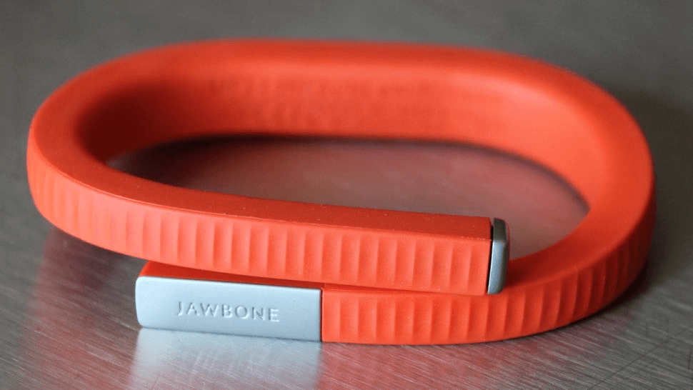
Jawbone’s UP was one of the first wearable fitness trackers on the market. The bracelet tracker was introduced in 2011 and quickly became a market leader. Unfortunately, by 2016, the company ceased production and stopped selling it altogether.
What happened over the course of those five years that caused this market leader to crash and burn?

Why it failed
Jawbone flopped for one simple reason: their products failed to keep up with consumer preferences.
Starting in 2012, other fitness trackers were introducing features that users wanted — a built-in screen, heart-rate monitoring, sleep monitoring, and more.
Jawbone, on the other hand, did not evolve their product. By 2013, reviewers were criticizing UP for not having a screen and not wirelessly syncing with many popular smartphones.
Jawbone started to add new features when they finally realized they were falling behind. Still, it was too little, too late.
What product managers can learn from this failed product
Jawbone should’ve put users at the center of their product development process. With a process for collecting and consolidating user feedback and insights, they could have built a better roadmap that kept pace with competitors and reflected what users wanted.
Instead, Jawbone prioritized great design over everything else. The Jawbone UP looked great, but it wasn’t waterproof, it broke easily, and it didn’t have the functionality of a Fitbit or an Apple Watch.
StumbleUpon
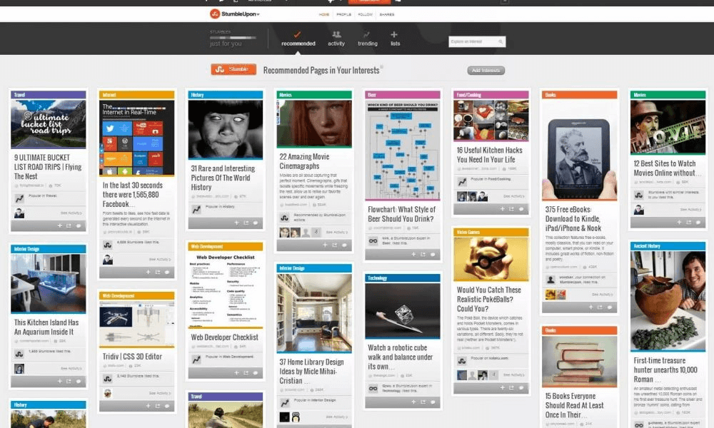
Before Facebook, Twitter, and Pinterest, there was StumbleUpon. StumbleUpon was one of the earliest tools that helped users filter down the myriad of content on the internet.
The company was never as big as Facebook is today, but it did have over 40 million users who “stumbled upon” 60 billion pieces of content in its heyday. After a slow decline, StumbleUpon officially shut down in 2018. What happened?

Why it failed
StumbleUpon failed for a similar reason to Jawbone: the company failed to keep up with consumer preferences.
StumbleUpon’s biggest value proposition was that it allowed users to explore the internet with no map or rules, serving up content as a “wacky game of roulette.” That approach was fun, but it required work.
Social media came along and made it easier for users to find new content with zero effort. Scroll through your news feed on Facebook, for example, and interesting, bespoke content appears right in front of you.
StumbleUpon never gained the ability to tailor content to individual users like Facebook, Pinterest, and Instagram, and their business suffered as a result.
What product managers can learn from this failed product
One of StumbleUpon’s weaknesses was its complex UI. Compared to Facebook, Twitter, and Pinterest, StumbleUpon wasn’t easy to use. If the company would have consistently gathered feedback from users, they may have become privy to this problem earlier and been able to act fast.
Additionally, StumbleUpon lacked sophisticated competitive analysis in its product strategy. Because of this, they were unable to stay on top of their competitors’ strengths and weaknesses, which would have helped them adjust their roadmap as needed and “keep up with the times.”
Unfortunately, by the time StumbleUpon realized its design and competitive deficiencies, it was too late to stop the bleeding.
Allo
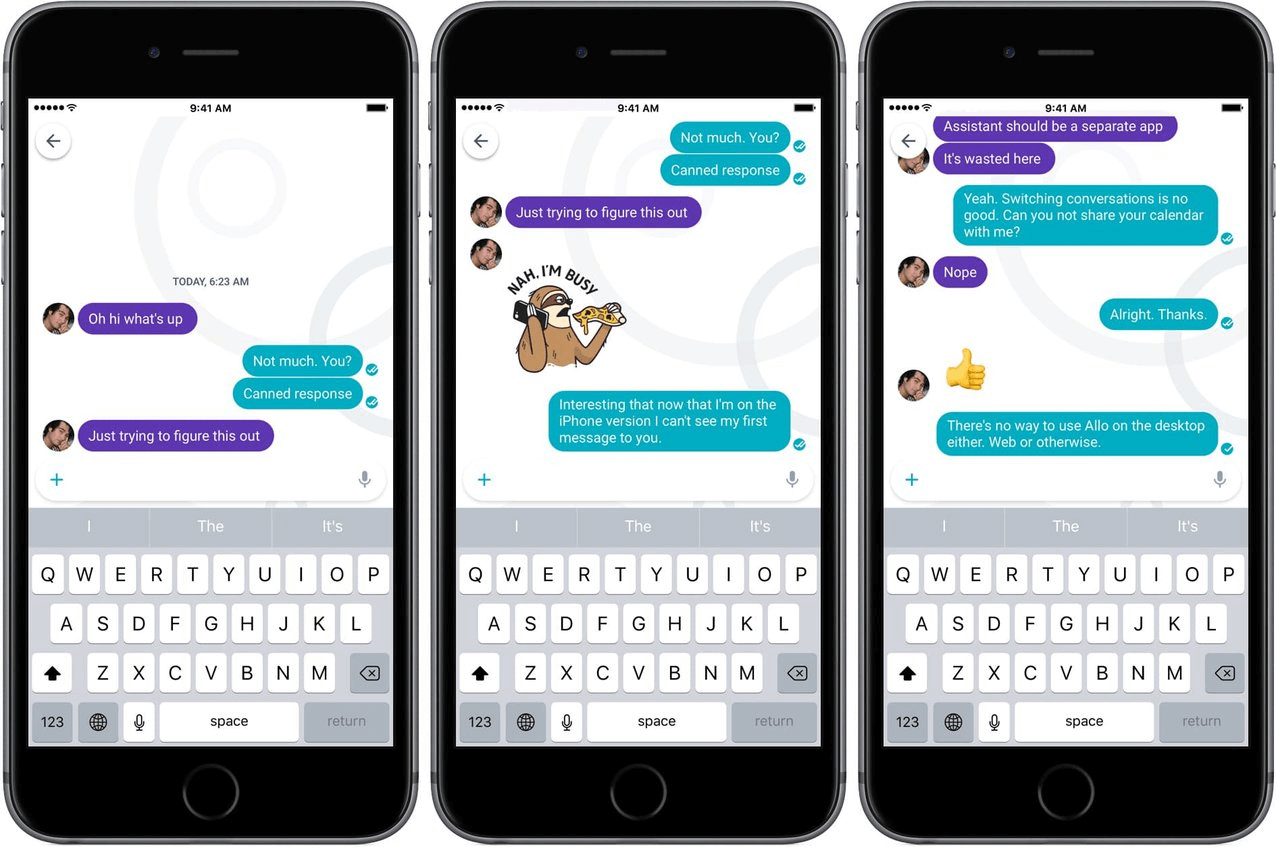
Even the tech giants develop products that flop. Allo was Google’s answer to Facebook Messenger and WhatsApp. The chat app was launched in 2016, but by 2018, it failed to gain any traction, and Google shut it down.

Why it failed
Allo was completely unremarkable. Early reviewers called it “fine” and wrote, “If it never existed, the world would never have missed it.” Ouch.
Google tried to force Allo into a competitive space by making it do everything that existing chat apps already did. However, there was nothing unique that compelled users to switch to the Google app.
What product managers can learn from this failed product
There’s no doubt that Google conducted competitive analyses and gathered user feedback to develop the product. What they didn’t do was use that data to differentiate their product.
Competitive analyses are great tools when used right, but if you’re using them to copy exactly what your competitors are doing, you’re missing the true value. Use your competitive analysis to find your competitors’ weaknesses and develop your own product features that are better, different, or exceptionally innovative.
. . .
It’s true that some of the product failures above may have been unpreventable (sometimes your competitor is just too good, for example), many can be avoided by mastering the three pillars of Product Excellence — deep user insights, clear product strategy, and inspiring roadmap. A strong methodology like this can help you stay in tune with your users, inform your decision-making processes, and focus your teams on what matters most. All this matters greatly in the pursuit of product success.
And while we’d all like to think that we can learn everything from simply reading, sometimes you do have to learn by making mistakes on your own in the real world. We simply hope that these cautionary tales will minimize common product management missteps that we see over and over again.
. . .
Productboard is a product management system that enables teams to get the right products to market faster. Built on top of the Product Excellence framework, Productboard serves as the dedicated system of record for product managers and aligns everyone on the right features to build next. Access a free trial of Productboard today


