A guide to mastering user-driven product onboarding (with real-life examples from Productboard!)

Looking to improve the user onboarding experience within your product? Want to not just acquire new users, but get them to stick around with your product for the long-run?
Not all user onboarding is created equal, and there’s a key principle that’s easy to overlook when designing your product’s first-time user experience:
Users come to your product looking to address a need, and at its core, your onboarding must help them appreciate how your product can help — why your product should matter to them.
Yet as a first-time user of other digital products, you’ve likely experienced time and again products where onboarding is limited to feature-centric UI tours that do little to explain what user needs the product can help solve. Or maybe you’re immediately directed to invest time into configuring the product from onboarding before it’s clear what it even does.
It’s clear why user onboarding is so often lacking. Product teams are so close to the features they’ve labored over that it’s easy to assume their value is obvious to first-time users. But that’s far from the case. All too often, users confronted by lackluster onboarding click around your product for a minute, then navigate away never to return.
The five stages of user-driven product onboarding
We’ve found it helpful to think of user onboarding as a smooth ramp. It meets new users where they’re at (level 0, not level 3) and takes them from barely knowing what your product does to appreciating its value, committing to using it, and succeeding in the long run.
Here’s what this looks like from the user’s perspective:
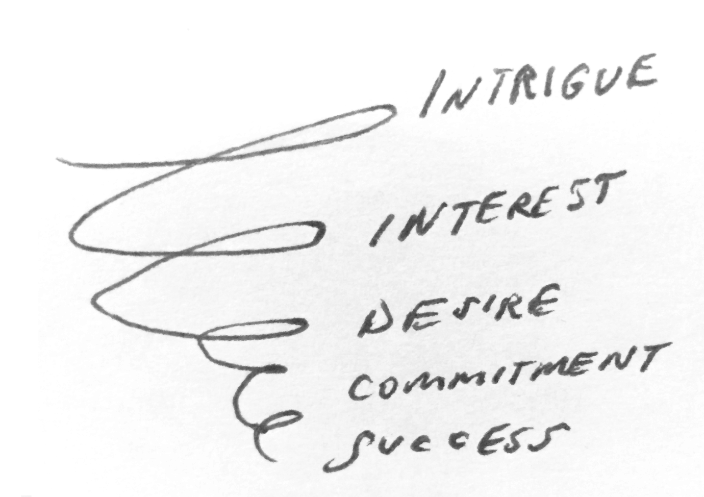
Just as your marketing funnel can spring leaks, the user onboarding ramp can launch riders off into the ether if the pace of learning is too steep to grasp your product, riddled with holes, or missing guardrails at key junctures.
Below we’ll explore each phase in turn…
- Intrigue
- Interest
- Desire
- Commitment
- Success
And discuss the principles that support the ramp…
- Each onboarding phase must actively motivate users to move on to the next step of the product experience.
- Users are motivated to learn more when you make it clear why your product matters to them during onboarding.
- Motivation is bolstered by the gradual introduction of detail, and by progressively increasing demands for user investment (it’s killed by the reverse: floods of detail and early asks for investment).
This approach helped us prioritize our earliest user onboarding initiatives within our product and will continue to guide our approach moving forward. We speak from experience, so the examples provided may relate most to other B2B/SaaS startups, though I think you’ll find the principles themselves to be universal.
User-driven onboarding stage 1: Intrigue
“I wonder if this could be a helpful tool…”
When users first land on your site or enter your product/trial, it’s safe to assume they have little appreciation for how your product can help them, if any understanding at all. Your goal at this stage of onboarding is to move users from intrigue to interest, so they’re motivated to explore your product and solution further.
Start with why
At best, the content on your website can be a powerful onboarding tool — it inspires intrigue by speaking directly to the needs your product can help address for users. In other words, value offered — not features.
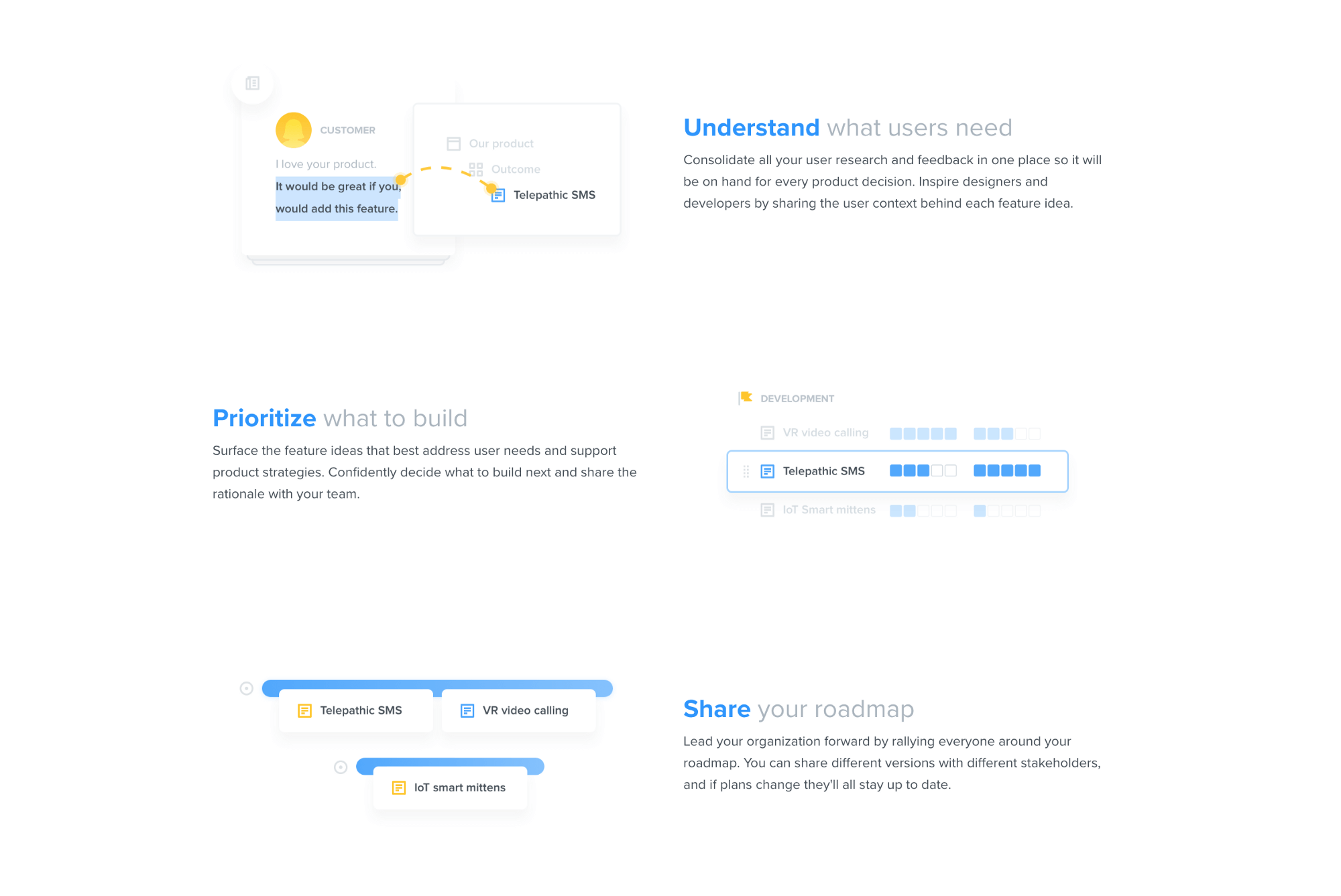
When it comes to web content best practices, value-based headlines often work better than feature-centric ones. Feature-centric headlines assume that the value of your features is clear (hint: they’re often not). Even when your product is in an established space (e.g. CRM), you’ll want to communicate the value your features offer that differentiates you from the competition.
In time we also supplemented our value-based headlines with an explainer video that covers the problems that productboard solves for users while answering the question why now? It touches on key trends in product management that make it more important than ever for product managers to adopt customer-centered, data-driven, transparent processes that can be supported by a system like productboard.
Starting with why: explainer video
Why ➡ What ➡ How
The explainer video was one way we might drive users from intrigue to interest before even entering a product trial, but we were still under no illusion that new users understood what productboard is and how it solves their problems. That would have to be explained to them upon entering the product, during official user onboarding.
In the early days at productboard, we created a high-level overview video users would see as soon as they started our trial. The goal was to go just one level deeper in showing users the possibilities of productboard, to motivate them to explore further.
The video was absolutely brutal to script because we had to find a way of communicating the core value of each of our flagship features in under two minutes, without going into any of the details on how the features really work.
It's a tall order to get users to commit to watching a two-minute video when many want to get started clicking wildly around your interface to figure out what it does for themselves. But, we figured if we followed a few principles, we could maximize its value for our target users:
- Keep the video focused on the value offered — the why.
- Keep the video short and sweet.
- Make the video easily re-launchable.
Later on we also added a welcome animation to the trial for those who wanted to jump straight in and preferred a 15-second orientation over a two-minute one.

The animation works wonders because it addresses a few objectives at once:
- Reminds users of the core needs that productboard addresses.
- Orients users around key interfaces and shows them how they map 1:1 to the core needs.
- Illustrates the directional flow of data through the system.
- Hints at where our product sits between existing systems and how it plays friendly with existing tools (e.g. Intercom, Zendesk // Jira, Trello, GitHub, Pivotal).
- Takes less than 15 seconds to watch.
Videos and animations aren't the only solutions for driving new users from intrigue to interest, but they're a great starting point for reemphasizing core needs addressed, illustrating how your features address core needs, and orienting users within your product.
Tips to consider at stage 1
? What is your product's core value proposition? Go one layer deeper and break it down: What are ~3 needs it helps users address? How does it do that?
⚠️ Avoid directions for getting started at this juncture. Keep the focus on core value offered.
User-driven onboarding stage 2: Interest
"Let me just tinker around to see if this has any promise…"
If you've gotten users this far, you've probably already managed to channel their haphazard clicking around your UI into more focused experimentation. But how do we drive them to the point of desire, where they're ready to invest serious time in experimenting with their own data, configuring their workspace, or setting up important integrations?
How do you drive users straight from onboarding to an 'aha' moment within your product?
The answer is typically spotlighting your flagship feature and demonstrating how it's valuable. Users' imaginations will now be on fire with the possibilities of using this feature with their own data…tears of joy brimming in their eyes as they catch a glimpse of a better future, empowered by your solution. ?(Product managers can dream, right?)
This is where an onboarding tool like Appcues or Intercom Product Tours could be especially helpful. You could create a series of trailblazes or help bubbles laid directly over your UI to direct users' attention, demonstrate how key features work, and explain why they matter.
At productboard, we were short on time and resources in the early days, so we bypassed formal onboarding in favor of getting started videos that appear when you first land on each key interface, and are re-launchable at any time. Whereas the explainer and overview videos above focus squarely on value offered, only hinting at the what and how, these videos go a level deeper into how our flagship features work.
Getting started video for the Insights board
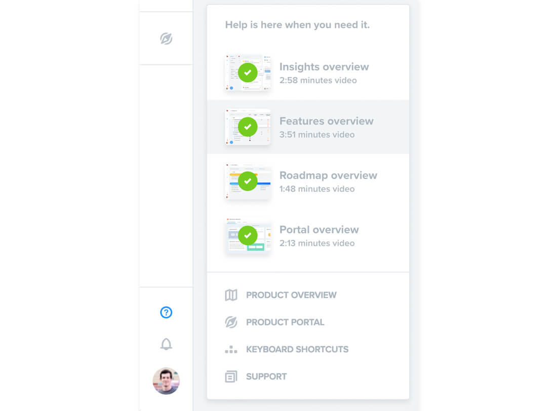
The sole goal of the videos is to focus user experimentation around the flagship feature: highlighting insights and linking them to related feature ideas. In our case, once users grasp the power of being able to see everyone who's requested each feature idea (and exactly what they said about it), they'll have all the motivation in the world to learn how to import their own data. But that comes later.
Tips to consider at stage 2
? What is the aha moment for users in your product? Which of your flagship feature produce that aha? How can you demonstrate how it works during onboarding to get users to the aha moment as soon as possible?
⚠️ Avoid bogging users down with detail. Avoid introducing lesser features at this phase.
User-driven onboarding stage 3: Desire
"Let me try this with my own data now…"
Now that users have an appreciation for what your product can do, they're ready to invest more time by putting it to the test. The next onboarding steps will vary depending on the nature of your product, but the goal will remain the same: to advance users to the next phase — commitment – where they will have decided that they want to move forward with using your solution.
Some questions to consider:
- What's the minimum amount of data users need to create/import to test out your flagship features and appreciate their value?
- How can you simplify the process of allowing users to import or set up this data (either through onboarding directions, or features like integrations, wizards, and import tools)?
- How can you empower customers to formulate a proof of concept they'd be ready to share with others?
In productboard, we offer simple tools for importing users' own data: existing user feedback, feature requests, and feature ideas. Of course, there's even more we could do here. The directions we offer users at this stage are presented at the end of our getting started articles and videos. We could use custom events to display these directions in-app immediately after a user has first tested out a flagship feature.
Tips to consider at stage 3
? How can you help users experience the aha moment for themselves, getting a tiny taste of the value your product offers, using their own data?
⚠️ Users haven't committed to using your product yet, so it's not time to send them a comprehensive checklist of all they need to do to get set up.
User-driven onboarding stage 4: Commitment
"All systems go! I'm ready to become a customer. Help me get all set up."
If all's gone well, those users who have experienced the aha moment firsthand with their own data will now be ready to move forward with your product. This is the moment users will be the most excited, and a sign of product onboarding success! How will you help them get set up ASAP? If you do this right, time-to-value will be low and they'll be set up for the next phase: long-term success.
At productboard we've taken a number of steps to reduce friction to getting started as a customer, like simplifying the process of integrating with customer touchpoints (Intercom, Zendesk, email, Zapir) and project management tools (Jira, Trello, GitHub Issues, Pivotal).
One idea we're still exploring is a comprehensive checklist of all the things users need to do to get fully set up. It would both direct users what to do next and help them visualize how far they've come. Intercom's onboarding process provides a good example of this approach, and Appcues now offers checklists as a feature in its onboarding app for product teams.
Tips to consider at stage 4
? What's required for users to get ongoing value from your product? How can you direct them to get set up as quickly as possible?
? Even if the user is committed to using your product, do they face other barriers before they can buy it? (e.g. convincing colleagues, or their boss, or their CFO to invest in your solution) How can you enable them?
⚠️ Some things can wait. Avoid sending users every best practice and just focus on getting them set up.
User-driven onboarding stage 5: Success
"We've just renewed for the third time and can't stop recommending this solution…"
As the months wear on and the honeymoon with your product is long past, how will users cope with inevitable setbacks: feature gaps, usability issues, and the realization that your product is not a silver bullet for all their problems? How can you help users develop the right habits, and adopt best practices to succeed in the long run?
At productboard we're especially aware of any usability issues and feature gaps that exist in our product, because when they're reported by users (via Intercom chat, our customer Slack community, or our Product Portal) they're funneled straight into our team's own productboard project!
We then help customers succeed in a number of ways:
- Publish best practices articles on our help site and blog.
- Moderate a customer Slack community where members of our user community help one another and we can jump in to answer questions, provide suggestions, and introduce product updates.
- Go above-and-beyond in support by proactively anticipating challenges during routine communications with customers on Intercom chat.
We have a number of ideas for improvement here as well:
- Improve notifications to help users develop the habits of successful product managers and get more value from productboard.
- Email new customers best practice content when they're most likely to need it.
- Run best practice webinars specifically tailored to the needs of existing customers.
- Host live events where users can share tips they've picked up along the way.
Tips to consider at stage 5
? How should users configure their data to increase their chances of long-term success? What tips can you provide to help them bypass feature gaps and usability issues? What habits should users develop to get the most value?
⚠️ Don't wait until you have a churn problem to implement these systems. Be proactive about ensuring customer success.
User-driven product onboarding & Product Excellence
We've always seen product onboarding as just another solution to the user need of understanding the value of our product and getting access to that value sooner. But in the rush to acquire new users, it's easy to forget how overwhelming it is to try out a new product.
The best onboarding meets users where they're at. It starts with why (user needs addressed, value offered) and gradually introduces details along the way (what your features are and how they work). Assuming a more expansive view of onboarding has helped us smoothly ramp up new users, motivate them to keep going, and set them up to gain more value in the long run. We still have a ways to go, but by adopting a customer-driven approach from the start we've laid the foundations for Product Excellence — and you can too.
. . .
productboard is a product management system that enables teams to get the right products to market faster. Built on top of the Product Excellence framework, productboard serves as the dedicated system of record for product managers and aligns everyone on the right features to build next. Access a 15-day free trial of productboard today.


![The CPO’s Blueprint for Annual Planning: An Opportunity to Drive Change [Part 3]](https://www.productboard.com/wp-content/uploads/2024/11/strategy-blueprint-560x293.png)
