From 0 to 100 million readers: How Highlights on Medium changed publishing forever

It was January of 2016, and President Obama’s White House staff were preparing for the annual State of the Union.
It was the second year the team had published the complete text of Obama’s speech on Medium, ahead of his address, in an effort to make the speech more accessible to the general public. People could follow along with the speech in real-time, and, using Medium’s recently launched Highlights feature, share memorable passages with their friends on social media or provide comments.
Meanwhile, for Nick Santos and the other Medium engineers building Highlights, chaos reigned. Readers were highlighting passages of Obama’s speech as he read them, but the feature wasn’t built for high-volume real-time use. The high load took down the article for the duration of the speech. Instead of seeing highlights and comments from their friends on Medium, visitors were unable to access the transcript at all.
For Nick and the product team at Medium, though, that failure was the ultimate validation of a feature they’d been slowly improving since it first launched over a year earlier.
Highlights, when it first launched in 2015, allowed users to mark a phrase, a sentence, or a paragraph in any Medium article. Each Highlight was then treated as an independent article where readers could add comments, reply to other peoples’ comments, or share the Highlight directly on Twitter.
At the time, the feature wasn’t met with much fanfare. But in the years following the launch, the popularity of Highlights exploded. The feature has been lauded by readers and writers alike, gathering a healthy following of users (and copycat companies), along with a constant stream of product improvements.
Why the popularity? With Highlights, Medium spied an opportunity not only to make sharing writing on Medium easier, but also to turn the tool into one of the leading online publishing platforms. Highlights played an important role in the ongoing development of Medium — and the development makes for a fascinating story for product managers and anyone interested in tech.

The productboard team recently jumped on a call with Nick, now CTO at Tilt, to find out how the team developed and launched Highlights, and why the feature has been so valuable for Medium. And, of course, to share some of those lessons and insights with you.
Strap in — this story’s more adventurous than you might expect.
Table of Contents:
- Engagement over eyeballs: Medium’s one key metric
- The origin of Highlights
- Highlights help writers and readers alike
- Improving Highlights after launch
- A few lessons product managers can learn from Highlights
Engagement over eyeballs: Medium’s one key metric
How do you measure the success of writing?
Evan Williams, co-founder & CEO of Medium, who had previously founded Blogger and Twitter, envisioned the platform occupying the space between social media and real-time news — longer than Twitter’s original 140 character limit, but shorter than a sweeping news post.
Medium’s goal of being a platform for both stream-of-consciousness conversation and long-form writing made measuring value a challenge. Vanity metrics like views or clicks, for example, don’t really help when depth and engagement often matter more than reaching a larger audience.
Instead of seeking bigger and bigger numbers, product leader and investor Josh Elman recommends product teams choose just one metric that matters. The metric you choose will depend on your product and user base, but it should always signal two things:
- Your product is creating true value for users; and
- That people are using your product enough so that you can confidently predict they’ll return and use it some more.
That’s why from the start, Medium has optimized every product decision around a single KPI: Total Time Reading (TTR), or how long visitors spend reading.
Measuring TTR gave Medium actionable insights into how both readers and writers were utilizing the platform and interacting with specific posts. Total Time Read also served as the basis of Medium’s incentive model for rewarding writers. “We believe people who write and share ideas should be rewarded on their ability to enlighten and inform,” wrote Williams in a later post, “not simply their ability to attract a few seconds of attention.”
That drive for higher engagement is also what leads to the creation of innovative features — like Highlights.
The origins of Highlights
Medium’s Highlights feature is deceptively simple.
With a single swipe and click, you can select a word, phrase, or passage in any Medium post. A tooltip menu appears over the highlighted text — clicking the highlighter icon marks the passage as a Highlight.

When followers read the same story on Medium, they’ll see any Highlights you’ve made, and your name will appear when they mouse over the highlighted text. Followers can also “pile on” to your Highlights by clicking each highlight to quickly share with their own followers. Each time a passage is highlighted, the author receives a notification, so they know which parts of their articles are popular. Later, a feature was also added where readers could add a comment to each Highlight.
For such a simple feature, Highlights had “so many weird technical rabbit holes,” developer Nick Santos told me when we sat down recently. “It turns out it’s much, much more complicated than you would expect.”

Highlights wasn’t Nick’s first rodeo. His extensive development experience — seven years as a software engineer at Google building the Closure Compiler (a type checker for JavaScript), followed by four years at Medium leading development on writing tools — made him the perfect choice for launching Highlights.
Tasked with improving TTR on the platform, Nick and the rest of the product team set about finding ways of encouraging readers and authors to interact. “With Highlights in particular, we had something called the interactions team. Medium is not just a blogging platform, but a community where people interact with each other and become smarter based on those interactions. So the interaction team was tasked with making interactions between users better and more rewarding.”
“How can we make interactions between users better and more rewarding?” – Nick Santos, former developer at Medium
Highlights stemmed from a long-standing Medium feature called Notes. “With Highlights in particular,” Nick explained, “a lot of what we looked to was the Notes feature, where people would leave notes in the margin of a post. We also had a feature called Recommend Notes. When you clicked on Recommend you could write something you liked about a post.”
Nick and his team searched for ways of surfacing those Notes to readers and authors alike. “A lot of Medium’s product ideas come from a combination of analyzing product history and designers playing around with ideas,” Nick said. “Product managers spend time looking at the different ways people use features, what they try to use them for, and how they use them in ways that we didn’t intend them to.”
The difficulty of dogfooding (and why it’s worthwhile)
The strongest ideas are tested internally — known as “dogfooding.” Highlights was tested on a private internal version of the Medium platform known as Hatch. “Hatch was the internal company blogging platform,” Nick recounted, “where people posted all sorts of weird things. To some extent it’s a company chat platform, but also everyone’s trying to dogfood.”
Designers, developers, and product managers were encouraged to pitch features to test on Hatch. “For something like Highlights,” Nick explained, “we would roll it out in Hatch to probably seventy-ish people who would use it and give feedback. This gave us insight into how our users may leverage the feature.”
Internal testing moved quickly. “The initial prototype of Highlights that we launched on Hatch couldn’t have run for more than two weeks [from start to finish],” Nick recalled. “The second we launched it, we realized that there was all this complexity. People started to run into issues immediately.”
Consider the needs of different users
One thing the team hadn’t yet considered was how the user experience would play out for people who didn’t yet follow anyone on Medium, or for users who already followed many others. Without some Highlights being surfaced, the former group wouldn’t gain value from the feature — and without some filtering, the latter group would open a popular post only to encounter a wasteland of blue highlights.
“Shortly after we launched,” Nick explained, “we had to add a lot of filtering features and surfacing features. It was tricky to provide a good user experience to everyone — there are users who follow a lot of people on Medium and users who don’t follow anyone. We had to make sure to surface the right number of Highlights per post, weigh the ones from friends over ones from random people, or the ones that lots of people have highlighted versus one random dude.”
Nick and his team leveraged that valuable internal feedback to prioritize improvements and bug fixes. “Based on how people were using Highlights on Hatch, we figured out the infrastructure and what features to prioritize. All sorts of interesting questions came up. How you store the Highlights. How you represent Highlights in the back end. How you fetch them. How you visualize them. What happens when one Highlight overlaps another.”
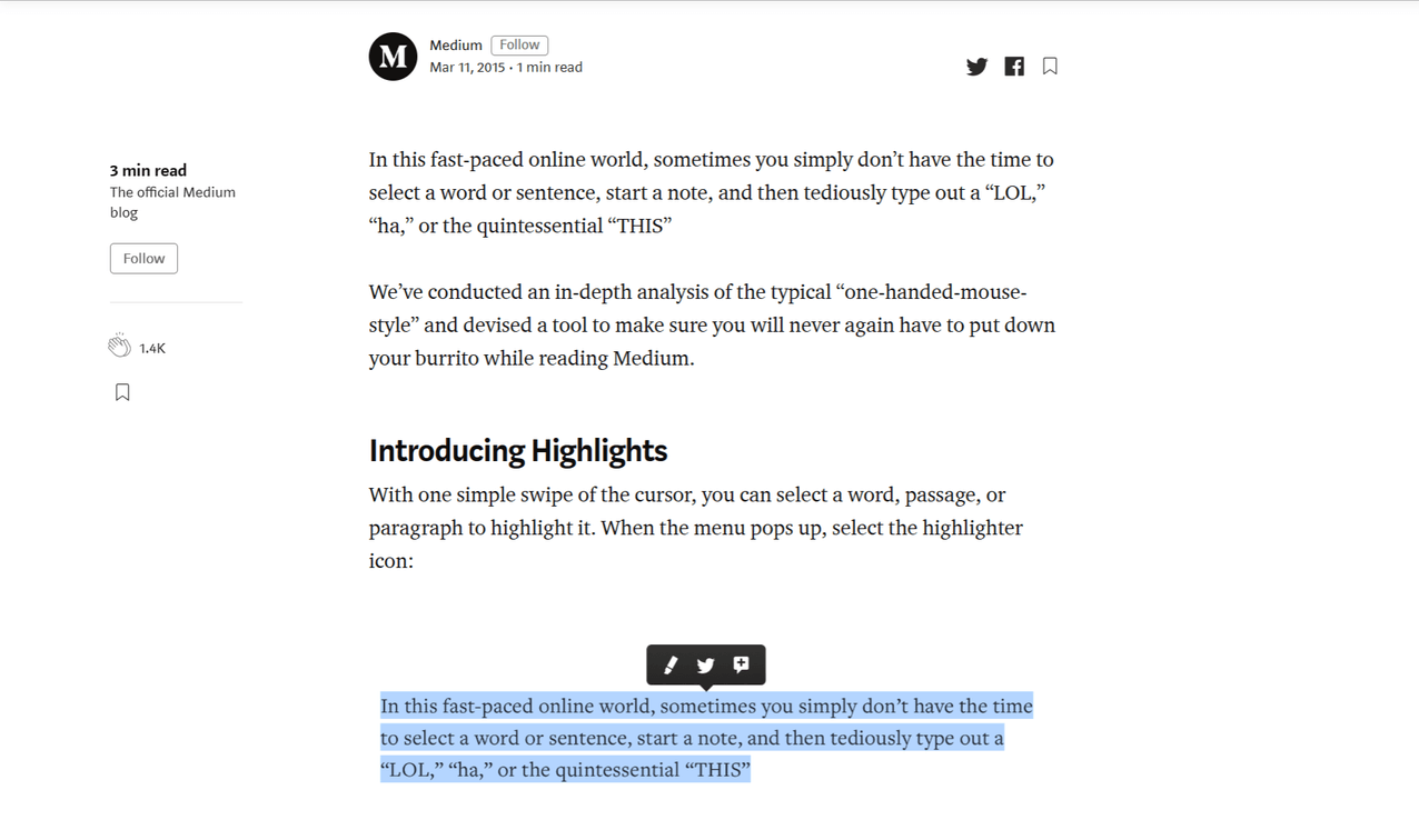
Finally, after months of internal testing, the team introduced Highlights to the public on March 11, 2015, giving readers and writers a lightweight way to connect — and eventually prompting avid Obama supporters to inadvertently bring down the platform.
Fittingly, they used the Medium Highlights announcement post to show off the new feature.
Highlights help writers and readers alike
Since launching, Highlights has become a highly successful part of the Medium experience, in large part because it directly benefits both the author and the audience.
Let’s take a closer look at both sides.
Highlights gets readers involved in the writing
For readers, highlighting makes the reading experience more social.
Rather than leaving a comment at the bottom of each post, like one might do with a traditional blog post, Highlights makes it easy for readers to mark their favorite parts and comment on that section independent of the rest of the post. Readers can share their favorite parts with their followers, and followers might notice things that they would otherwise skip over.
“[Highlights is] one of my favorite features on Medium that’s absent from many other interactive blogging settings. Definitely one of Medium’s USPs (unique selling propositions).” — Anonymous, Quora
Highlights gives readers a more granular way to engage with each piece of content. You’re no longer just scanning the top points; instead, you’re paying attention. You’re making time to capture your thoughts or challenge an author’s ideas.
That engagement doesn’t have to be positive to be valuable. Highlighting means different things to different people:
- They enjoy a quote, passage, or phrase.
- They resonate with an insight or concept.
- They decide to share a passage on another platform.
- They want to capture an idea to return to later.
- They disagree with a statement and want to comment.
No matter the purpose, social responses stimulate discussion. Seeing a lively debate among friends encourages readers to “pile on” and add their own thoughts. Social sharing tools make it easy to share that debate outside of Medium. And pretty soon each article takes on a life of its own that’s impossible to duplicate with traditional writing platforms.
But it’s not just readers who see the benefit of highlights.
Highlights let authors become better writers
For writers, feedback is currency.
Feedback is how writers learn what resonates with their audience and what flops. It gives them direction for how to improve their writing and better engage their readership.
Highlights gives Medium authors a direct line of feedback from their audience. Beyond the instant gratification of knowing someone read something they wrote, highlights help writers immediately pinpoint which parts of their posts are most engaging and worthwhile to read.
“When I see that some of my articles are all highlighted, it makes me feel I achieved my purpose. Not because people necessarily liked the entire piece. But, because they played with it — they made it their own.” – Gustavo Razzetti, Liberationist
Understanding what resonates helps authors write more engaging content and build a bigger audience on Medium. The high readership attracts the best writers. And the best writers get rewarded financially for sharing quality posts.
It’s a virtuous cycle that hasn’t gone unnoticed by other platforms.
Improving Highlights after launch
Annotating documents certainly wasn’t new — after all, students have been scribbling in the margins of textbooks for decades.
But Medium’s uniquely simple approach around how these comments are captured and surfaced to users quickly caught on — and not just inside Medium. Popular WordPress blogs launched detailed how-to posts and launched plugins to add inline commenting to existing blogs. Independent developers took to Stack Overflow and other online communities to ask how they, too, could create a Medium-esque highlighting feature. One designer even launched a Chrome extension that surfaces the top Highlights from each Medium post by simply hovering over the post, with the bold claim that “nobody has time to read anymore.”
None of this competition, of course, fazed Nick and his team, who continued searching for ways to increase engagement even further.
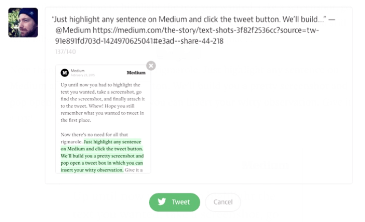
Soon after launching Highlights, they added Text Shots — a tool for sharing Highlights as screengrabs on Twitter. At the time, Twitter had just rolled out more visual Tweets with photo previews embedded into the timeline. The change had an immediate effect on the network — people began Tweeting more photos and attaching graphics to links. Interestingly, though, some users began sharing screenshots of text as a way of bypassing Twitter’s 140-character limit. Seeing an opportunity, the Medium team added a Tweet button to Highlights, which popped open a share dialogue with a neatly formatted graphic of the highlighted text, a pre-written Tweet, and link to the Medium post:
The improvements didn’t stop there. In June of 2015, the team launched Highlight Responses, giving readers the option to respond directly to Highlights. Each response links back to the original post but is treated as its own independent post on Medium, where other readers (or the original author) can highlight and respond in turn.
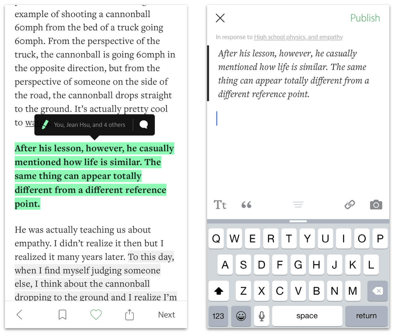
This change, in particular, underlines a key tradeoff every product manager faces: Should we prioritize engagement or ease of use? Allowing users to highlight other users’ comments and add their own thoughts leads to deeper discussion and, presumably, higher engagement. The potential downside to this flexibility, of course, is that multiple levels of post-ception increases the chances of users getting lost or losing track of the thread. Presumably, in this case, Medium decided to prioritize depth of discussion.
Then, in May of 2016, the team launched the ability to share Highlights directly from the Medium iOS app, making Highlights even more flexible (and portable):
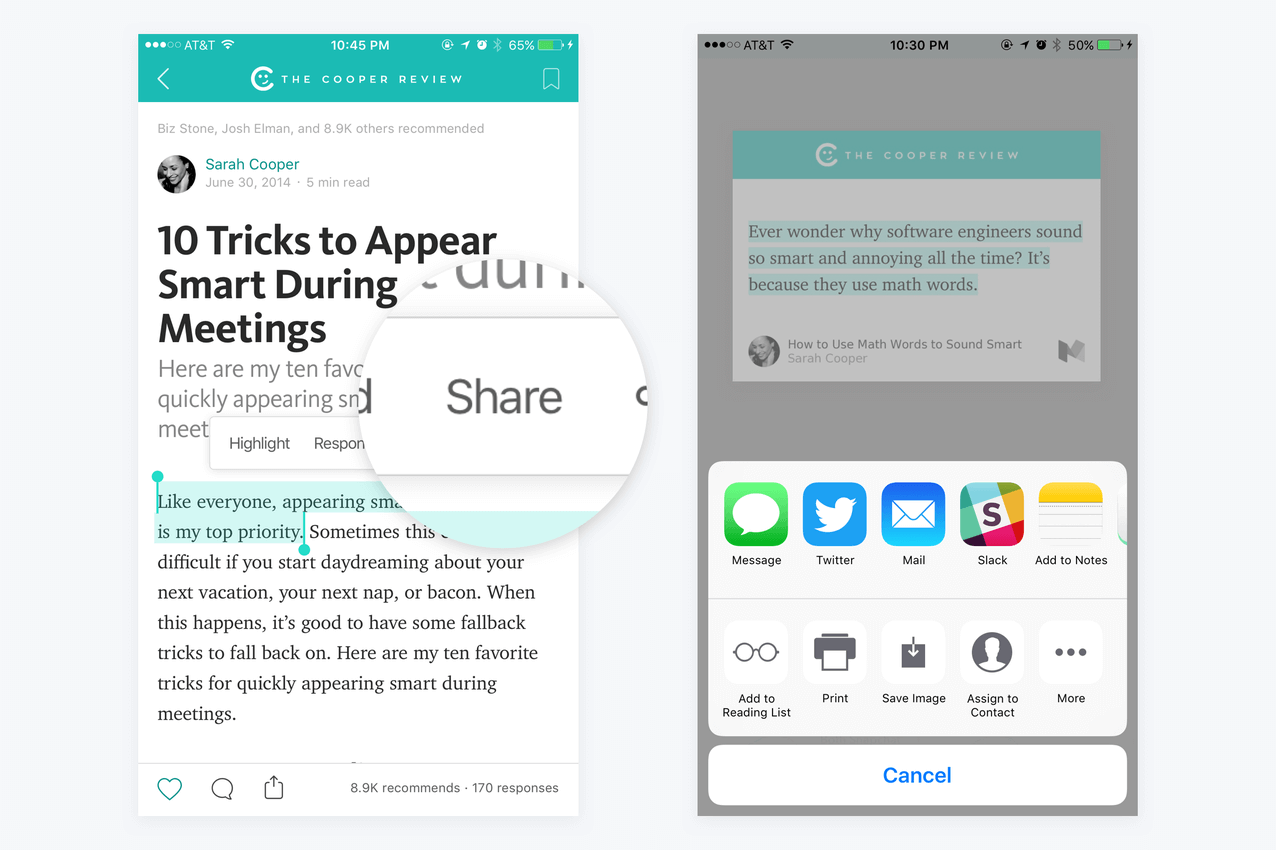
At the same time, they also improved the visual design of Highlights to match the custom color schemes of each publication:
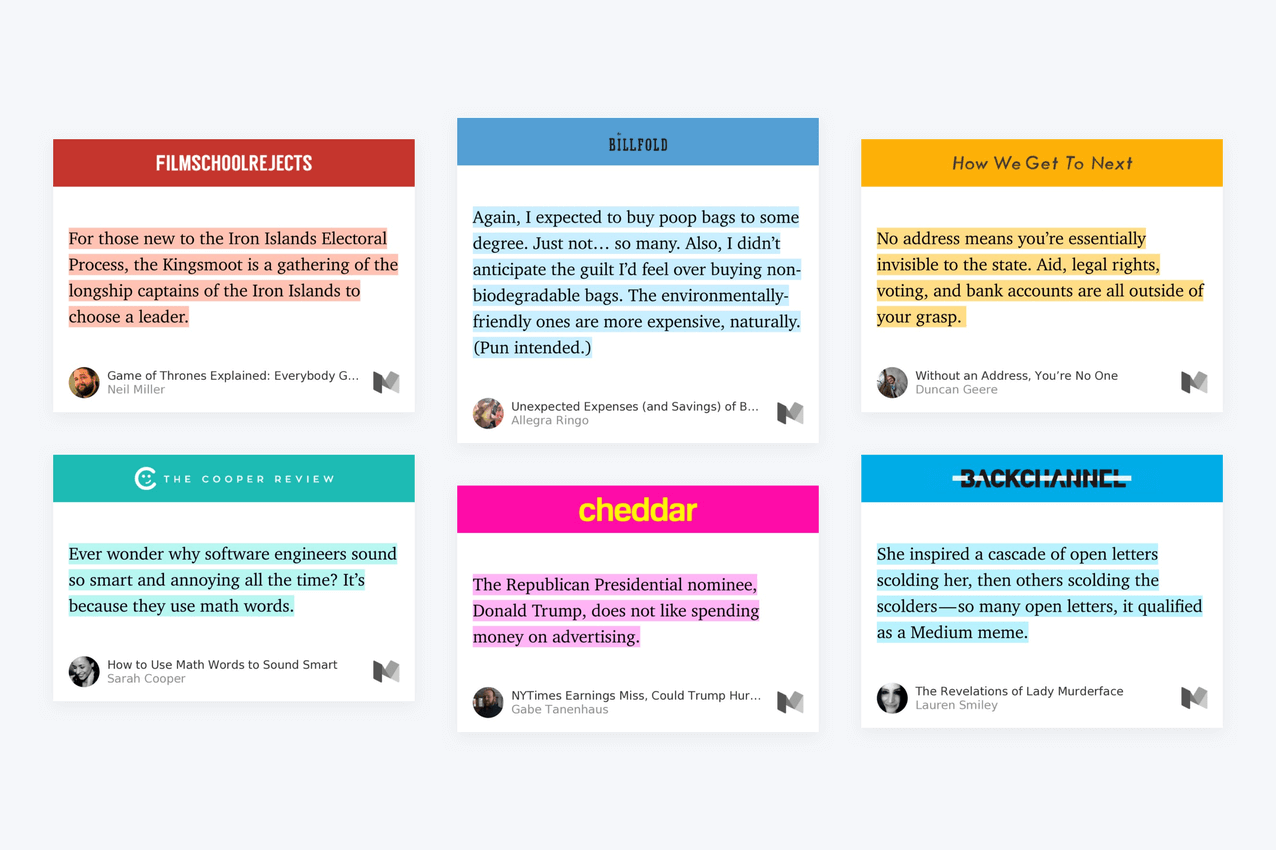
The Highlights feature continues to evolve.
A few lessons product managers can learn from Highlights
We can all learn a few product management lessons from the launch and evolution of Medium’s iconic feature.
Lesson #1: “Engagement drives stickiness drives retention drives growth”
When your product truly adds value for users, they’ll engage with it more deeply and return more often — especially for consumer products like Medium. That increase in engagement makes your product more “sticky,” leading to higher user retention and sustainable growth.
The Highlights feature hits on all the right elements for Medium. Giving readers the ability to play with posts and interact with followers promotes engagement and encourages return visits. Collecting data on Total Time Reading lets Medium improve their algorithm and promote the most engaging articles, driving sticky readership and retaining more paying subscribers. Giving authors the feedback they need to become better writers and build an audience ensures they’ll continue writing on Medium over other platforms, driving sticky authorship and retaining more writers.
You can do the same with your product as well. Take a look at your product and the metrics you’re tracking:
- Do your metrics truly measure engagement with your product, or are they vanity metrics? If the latter is true, can you find one metric that is a better measure of the value users are really getting from your product?
- Look at your product roadmap and rank features based on estimated impact on your one metric that matters. How does that affect your feature prioritization?
Lesson #2: Start small (but not too small) and iterate as you learn
Minimum viable products, or MVPs, might be all the rage, thanks to the Lean Startup movement, but Medium took the time they needed to make sure their MVP was truly viable. There’s no substitute for real user feedback and learnings — even if those users are inside your company.
Dogfooding — or testing an internal prototype — let Nick and his team work out all the unexpected kinks in the Highlights feature before they launched to the public. The team also had a keen awareness of which features were essential (such as filtering and surfacing features) and which could wait until later (for example, Highlight Responses).
Consider any features that you plan to launch in the next few months:
- Have you taken every opportunity to test and validate those features internally before launch?
- If not, can you create an internal version of your product, like Medium did with Hatch? How can you encourage an open culture of testing and “moonshot” ideas within your internal platform?
- Is your MVP truly minimal — are all your “essential” features truly essential? What needs to be included with the initial release, and what can be iterated and improved on overtime?
Lesson #3: Don’t assume everyone uses your product the same way
It’s easy to assume that everyone will use your product in the way you expect, following the same happy paths and avoiding unexpected use cases. But, as the story of Obama’s State of the Union speech shows, that assumption can prove shortsighted — and, depending on your product, even dangerous.
As product managers, we’re tasked with making design trade-offs with every release. Should the team invest the time in resolving corner cases, or in new features that help move the growth needle? This decision is where prioritizing by objectives comes in handy. A Prioritization Matrix can help visualize the tradeoff between potential impact, user value, and development effort, keeping the team aligned and working on the most important use cases.
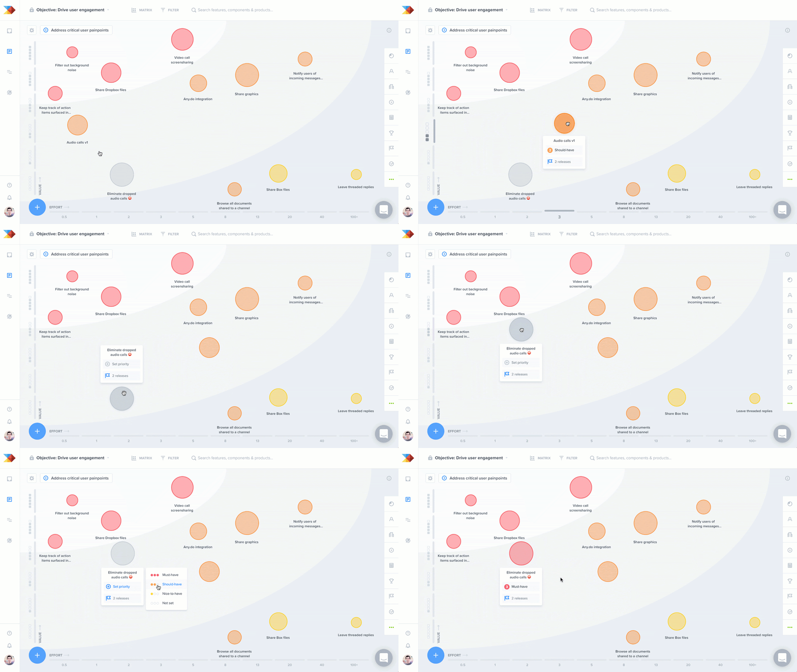
Choose one upcoming feature on your roadmap and brainstorm a few user stories that fall “outside the box”:
- Are these features truly “must-haves,” or can they be delayed until a later release?
- How might the experience differ for new users versus those who are already established on the platform?
- Are there existing features you can iterate on and leverage (as Medium did with the original Notes feature) to improve the user experience?
- Are there any additional features that align well with your roadmap (like Text Shots) that would provide a better experience for a small investment?
Words still matter
“We don’t know all the answers,” wrote founder Evan Williams when he first introduced Medium to the world in 2012. “But we know that words matter (still), so we built a better system for sharing them.”
Thanks to features like Highlights and developers like Nick, the system works. Today, Medium is one of the largest writing platforms on the web, boasting $5 million in payments made to writers, 20,000 articles published per day, and nearly 100 million monthly readers.
Since launching, Medium has set the standard for how readers and writers alike connect hearts and minds. Smart prioritization, innovative features, and a relentless dedication to the right metrics have helped Medium achieve its greatest feat: bringing understanding to the web instead of just words.
Not so smug now are you, pen and sword?
. . .
This post is a preview of a new content series on how iconic product features were developed. Don’t miss the next article in the series. Sign up for our newsletter and join the discussion by leaving a comment below.
This post has been published on www.productschool.com communities.


![The CPO’s Blueprint for Annual Planning: An Opportunity to Drive Change [Part 3]](https://www.productboard.com/wp-content/uploads/2024/11/strategy-blueprint-560x293.png)
