Dan Olsen’s Product Strategy Framework

Written by Dan Olsen, Product Management Consultant and Author, for our ebook, The Path to Product Excellence: Stories and Advice From the Field.
When Instagram first launched, there were already many photo sharing mobile apps on the market. Yet Instagram quickly became the top photo sharing app. Why was Instagram’s product so successful? I want to share some important product strategy tools that answer this question and can help you make your products more successful: The Kano model and the Product Strategy Grid.
The Kano model
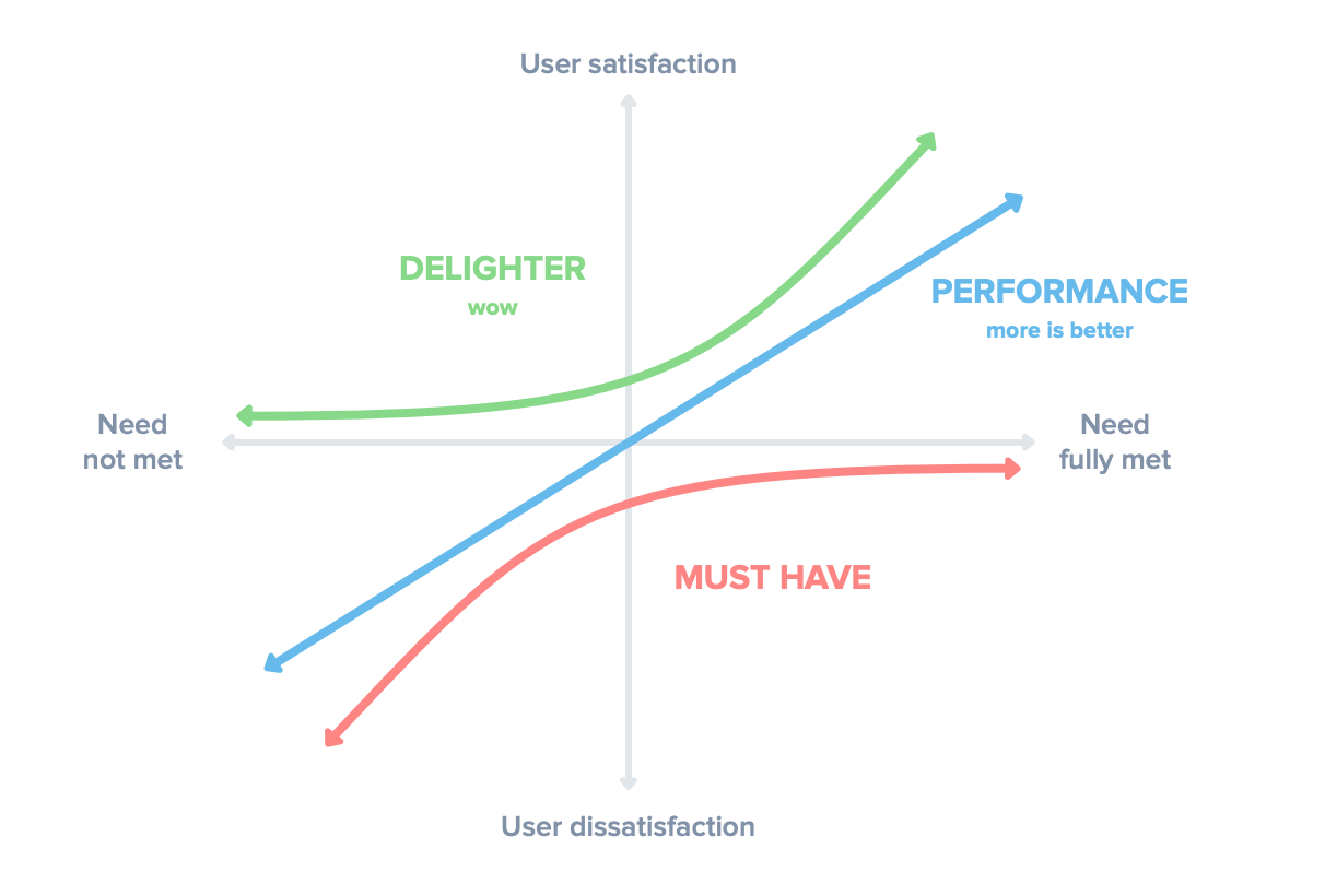
The Kano model, shown below, plots how fully a given customer need is met on the horizontal axis and the resulting level of customer satisfaction on the vertical axis. The horizontal axis ranges from the need not being met at all on the left to the need being fully met on the right. The vertical axis ranges from complete customer dissatisfaction at the bottom to complete satisfaction at the top.

The Kano model classifies customer needs into three relevant categories: performance needs, must-have needs, and delighters.
With performance needs, more is better. As the need is more fully met, the resulting customer satisfaction increases.
Must-have needs don’t create satisfaction by being met. Instead, the need not being met causes customer dissatisfaction. Must-have features are “table stakes” or “cost of entry”—boxes that must be checked for customers to be satisfied with your product.
Delighters, or wow features, provide unexpected benefits that exceed customer expectations, resulting in high customer satisfaction. The absence of a delighter doesn’t cause any dissatisfaction because customers aren’t expecting them.
The Product Strategy Grid
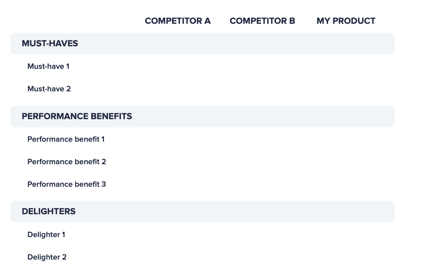
See the blank Product Strategy Grid template below that helps you map your must-haves, performance benefits, and delighters against your competition. In the first column, you list the benefits that are relevant to your product category—one per row, grouped by type. You want to include the relevant must-haves, performance benefits, and delighters. You should have a column for each key competitor and a column for your product.
Once you have established the benefits and competitors, you want to go through each benefit row and score each of the competitors and your own product. If you are assessing an existing product, you can score it; if you are building a new product, you can list the scores you plan to achieve. The entries for must-haves should be “Yes.” For performance benefits, you should use whatever scale works best for you; a scale of “High,” “Medium,” and “Low” usually works well. For performance benefits that are amenable to numerical measurement, you can use numbers for higher precision. Delighters are typically unique, so just list each delighter on a separate row and then mark “Yes” where applicable.

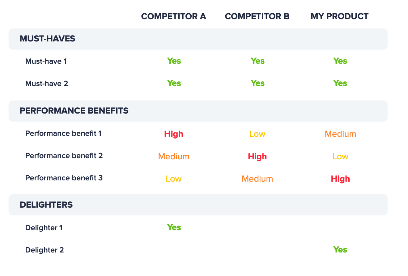
See the example below of a completed Product Strategy Grid. I’ve intentionally kept the benefits and competitors generic, so you can envision a similar grid for your product. In this example, there are two existing competitors for the new product you plan to build. All three companies have “yes” for all the must-haves. Competitor A is the best at Performance benefit 1, and Competitor B is the best at Performance benefit 2. You plan to be the best at Performance benefit 3. Perhaps you have identified a new customer segment that values Performance benefit 3 more than the others, or perhaps you have a new technology that you expect to yield higher levels of satisfaction with performance benefit 3. Competitor A has Delighter 1, and you have your own idea for a different delighter, Delighter 2.

Completing this grid helps you clearly articulate how your product will be better than the competitors. What matters the most from this exercise are your unique differentiators: the performance benefit(s) where you plan to outperform your competitors and your unique delighters. You don’t compete on must-haves. In our example, each product’s unique differentiators are shown in bold.
Instagram’s Product Strategy Grid
Let’s look at a real-world example of a Product Strategy Grid.
Why did Instagram become the top photo sharing app? How did Instagram outperform the other photo sharing apps? What unique delighters did their app have?
When I pose these questions in my workshops, the first answer I usually hear is “filters.” Filters were a delighter feature that delivered the benefit of “make my photos look good.” Instagram also helped make your photos look good by forcing a square aspect ratio. By requiring a square aspect ratio for photos, Instagram ensured that everyone’s feed of photos looked good versus having portrait orientation photos mixed in with landscape orientation photos, which would have to be shrunk in size to fit in the feed.
Finally, how did Instagram outperform the other photo apps? Compared to the other apps, uploading photos from the Instagram app seemed to be much quicker. The main way they did this was through a clever UX hack. After the user took a photo, all the other apps required the user to tap the “Share” button before uploading the photo. Instagram realized that users tap the “Share” button for a high percentage of photos, so rather than wait for the user to tap the “Share” button, the Instagram app automatically started uploading the photo right away. By the time users tapped the “Share” button 1 to 3 seconds after taking their photo, the photo upload seemed that much faster.
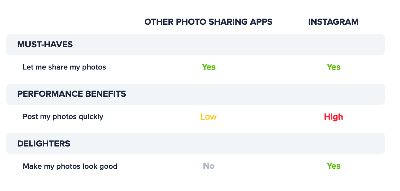
Let’s use these insights into Instagram to reverse engineer their Product Strategy Grid. We have a column for other photo sharing apps and a column for Instagram. For the must-have, we have “let me share my photos.” For Instagram’s performance benefit, we have “post my photos quickly.” And for Instagram’s delighter we have “make my photos look good.”
Understanding Instagram’s strong unique differentiators helps explain why it quickly became the top photo sharing app. In fact, Instagram’s original tagline was “Fast, beautiful photo sharing.” This tagline is very powerful and manages to convey their entire product strategy in just 4 words. The tagline covers their must-have: photo sharing; how they outperform: fast; and their delighter: beautiful photos.

I encourage you to use the Kano model and the Product Strategy Grid to ensure you have a clearly defined product strategy. You can learn more about how you can replicate Instagram’s success using the Kano model and the Product Strategy Grid in my book The Lean Product Playbook.
. . .
This post is an excerpt from our ebook, The Path to Product Excellence: Stories and Advice From the Field. Get your copy now for more valuable insights from product management thought leaders.


![The CPO’s Blueprint for Annual Planning: An Opportunity to Drive Change [Part 3]](https://www.productboard.com/wp-content/uploads/2024/11/strategy-blueprint-560x293.png)
