7 ways our Design team uses Productboard at Productboard
Productboard is designed to help product teams understand what customers need, prioritize what to build next, and align everyone around the roadmap.
Alongside product managers, our designers are avid users of Productboard and benefit greatly from gaining a deep understanding of customer needs and feedback trends, staying organized within our product teams, as well as understanding how our work fits into the all-company roadmap.
Not only does using our own product bring the same benefits as to our customers, but it also helps us understand the product’s quality, where there’s friction, and how well the solutions we design work for ourselves.
In this article, we’ll run through some tips on how to integrate Productboard into your day-to-day workflow. We’ll look at how we leverage Productboard for seven key activities, although it’s worth noting that each activity is important regardless of the tool(s) you end up using.
1. Capturing customer feedback in one place
The Insights board is the home for all your incoming research and user feedback, no matter who submits it — product managers, support, sales, marketing, or someone else. From Zendesk support tickets to Gong call recordings and Slack messages, it all comes to the Insights board to be categorized and accessed by anyone who wants to learn.
We write down and store notes from research sessions with customers, or even internal feedback from colleagues. If we’re onboarding a new designer into our product, they can capture their feedback and thoughts in a note in Productboard. This way, we avoid feedback being scattered across various docs, sheets, or Notion pages.
All of our teams know that Productboard is a single source of truth and acts as a feedback repository. When we start evaluating a new opportunity or looking into a customer problem, all feedback collected by any other member of the organization is readily available at our fingertips.
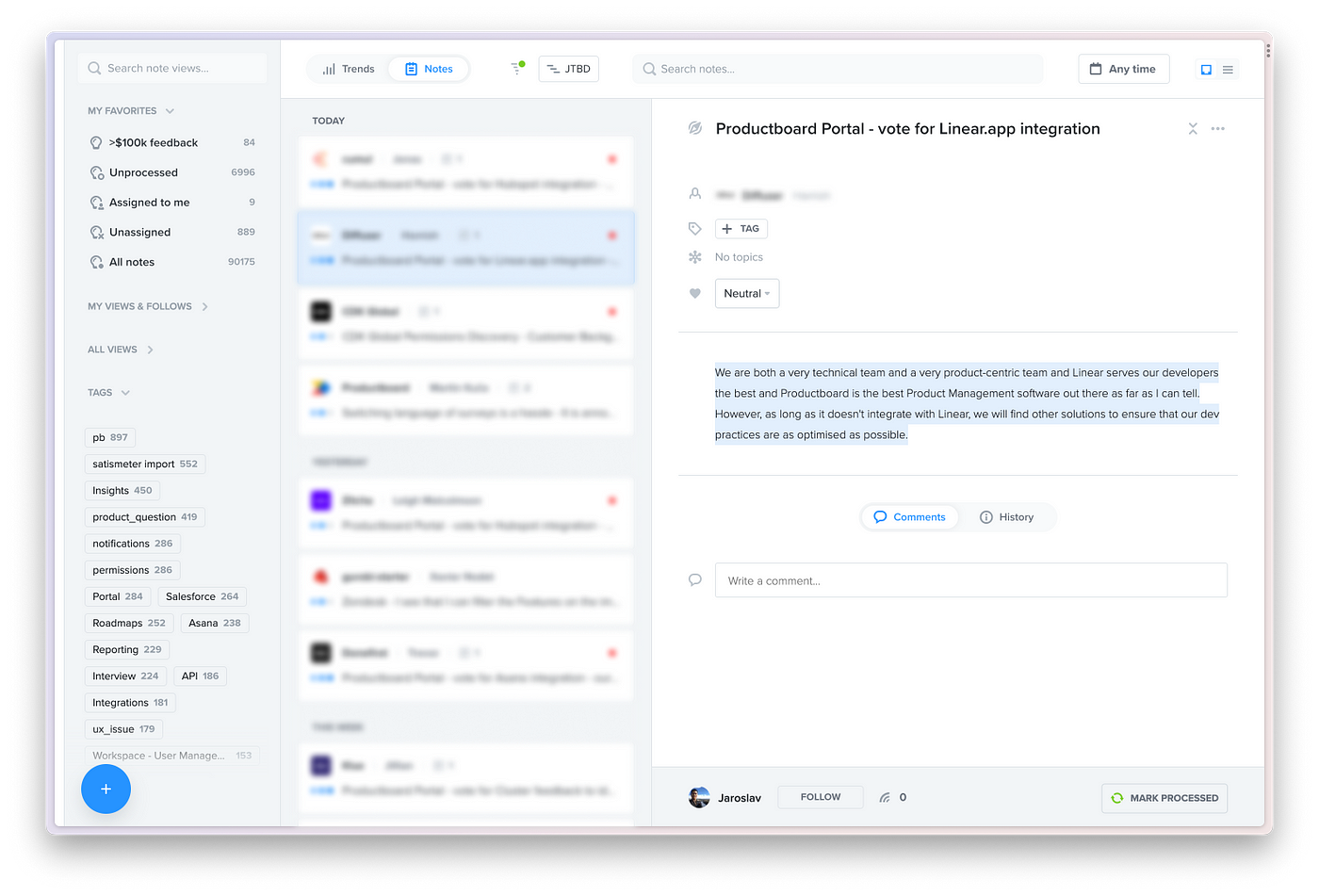
 Insights board that serves as a repository of all feedback.
2. Learning from incoming feedback
Designers need to know how customers are using their product — what they love, what they hate, and what they’re missing. Productboard lets us capture the most important parts of each feedback note and categorize it for easy retrieval down the road. This is what we call insights linking and processing.
The product enables us to highlight text and images in feedback and link it to nodes in the hierarchy that represent features, ideas, customer problems, or opportunities. Continuously processing feedback related to the domain we own not only benefits us but also takes some of the workload off our PMs.
And by setting up Insights Automations — a rule that picks up on any feedback matching certain criteria (keyword, tag, ML generated topic) — we can get relevant feedback to land straight in our folder, saving us time searching for it. Linking, processing, or just learning from continuous reading becomes simple.
Designing without understanding users is close to a guessing game, and more validation is usually required. Designers at Productboard tie all their solutions to known customer problems. That’s the lens we use to evaluate UIs in design critiques. Sometimes, we use direct customer quotes to justify design decisions when faced with opposing feedback.
Continuous learning, linking, and processing allows us to use the user impact score on the Features board to quantify which feature ideas address the most pressing user problems and needs. We’re able to see everyone who requested a particular feature, exactly what they said, and how important it is to them.
3. Understanding hierarchies, ideas, and opportunities
When working on any product, it’s critical for designers to understand what that product is, what it comprises, how it works, what problems it solves for customers, and what opportunities and ideas have arisen over time. The Features board is the place where we, and our customers, capture just that.
Being familiar with the hierarchy helps gain a complete picture of the product and its structure, which in turn helps when it comes to linking and processing feedback. This way, we can connect the world of feedback with feature ideas, create roadmaps backed by real customer feedback, and confidently prioritize what to build next.
There’s a ton of value in reading the product’s hierarchy to understand the domains it comprises, the JTBDs we build for, and all the feature ideas and improvements that others have thought of. The hierarchy helps us onboard new designers, but it also supports easier transition when a designer switches teams, or when their team switches domains.
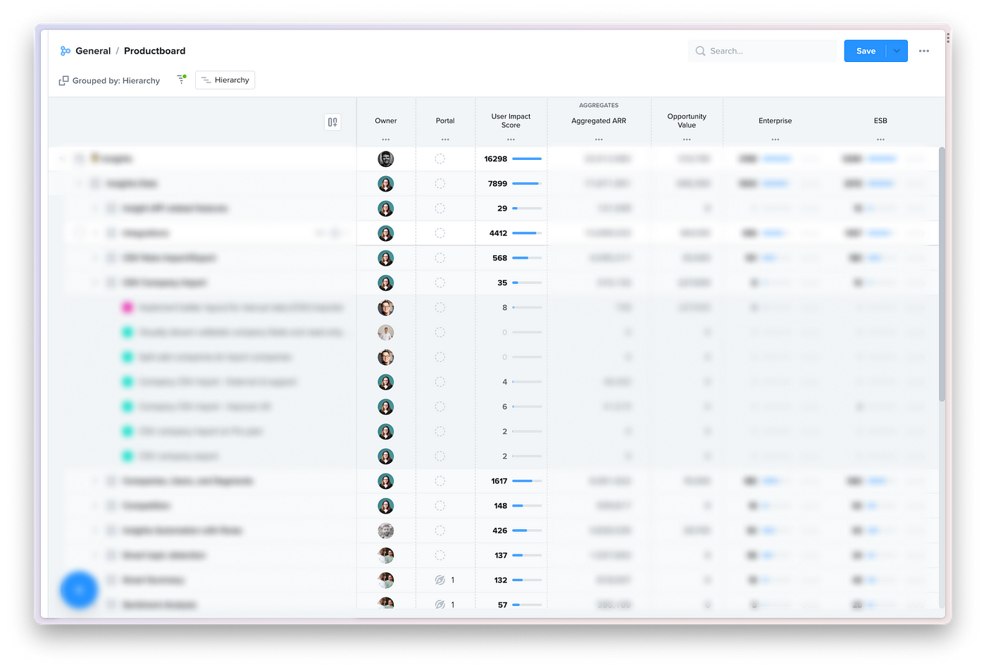
 Features board that captures how any product’s structure.
4. Planning and monitoring delivery, staying organized
Productboard allows us to view features by product team releases (sprints). This makes it the ideal place for sprint planning and preparation. As progress speeds up, or slows down, teams come into Productboard to adjust dates, sprint assignments, and work item statuses. All these changes then propagate to the rest of the product, so every roadmap is up to date without any additional effort.
Each designer can see what’s in upcoming sprints, understand what still needs designing or updating, and mark designs as done for their PM and engineers to see. Teams have different workflows and rituals for close collaboration, but as everything gets updated in Productboard, information travels upstream for leads and even execs to see and understand progress.
For features going into delivery, we often collaborate with our respective PMs on writing feature descriptions and acceptance criteria and link the right designs and specifications. Productboard supports embedding Figma prototypes, so understanding what to build becomes easier for engineers. For every feature, there’s a place to see linked feedback. So the engineering work is not only backed by customer needs, but everybody can see the real people and companies behind what they’re being asked to build. Features are then pushed to Jira. All the engineering work is managed there and synced back with Productboard.
Beyond our product team, Productboard’s roadmaps allow us to see what’s going on in our domain, other domains, and across the company as a whole. This helps us zoom out from what we’re working on at any given moment and see the grand plan of the company as it unfolds.
5. Understanding usability and UX issues
We consider usability or UX issues as anything that negatively affects the user experience of Productboard. We built a practice (and Insights Automation) to systematically tag these pieces of feedback with appropriate tags. This allows us to filter for this type of feedback and see what nodes in the hierarchy it’s getting linked to, or create a feature idea that covers an improvement and link the feedback there.
Seeing customers’ feedback linked to an improvement allows us to build a stronger case for investing in the usability of our product. This practice also gives us a good understanding of what issues there are across all domains, where they are most prevalent, how serious they are, etc.
6. Recruiting customers for research
Productboard helps us with another critical part of the design process: user research. Not only does it serve as a feedback repository, but our Salesforce integration can sync customers with Productboard. With all that customer data consolidated in one place, it’s the perfect tool for understanding who to source and recruit for an interview.
Productboard helps us build interview candidate lists. When working on discovering a problem or validating a specific solution, we can go through the linked insights and see which customers left feedback. The result is a list of highly relevant people to reach out to.
Productboard allows us to filter interview candidates based on the data we have about the companies they work for. We can filter candidates by a range of criteria, including:
- The pricing plan they’re on
- Number of employees
- Customer persona
- Amount of money they pay us
- Whether they’re a power user, or not
The options are endless, and our integration with Mixpanel and Amplitude allows us to define filters based on the data points we gather.
 A list of customers that helps with identifying who to recruit for an interview.
7. Tracking design system work
There’s a variety of feedback that makes its way to Productboard. Sometimes, our customers leave feedback on specific components, the legibility of in-app text, contrast, colors, etc. Internally, designers often speak about these aspects of our product during design critiques.
Our Design System team organizes all this feedback and links insights to their hierarchy. The hierarchy represents our design system and includes not just core components, but also foundations like typography, spacing rules, localization, illustrations, and many more. Patterns, transactional email, and even documentation is tracked there since it’s all in the realm of the Design System team.
This way, the team understands what internal teams need the most, sees which parts are talked about, and can better prioritize their work the same way as any other customer facing product team.
Getting into the habit
As with any tool, adding Productboard to our stack took some bedding in. But the more we use it, the more we realize we need it, and the more use cases it provides for us as a design team.
One thing we have found is that Productboard works best when we’re all using it as a team — and that means us designers alongside our product managers and even engineers. Ultimately, it’s all of our job to design and build products that meet — and exceed — our customers’ needs. Productboard helps us do that at every stage of product development.
Interested in joining our Productboard? We’re hiring! Check out our careers page.
Credits to the design team for collating together the original Slack thread that served as a source for this article. And many thanks to Pavel, Adam, Michal and Nick for their help with putting it all together.


